Don't use flexbox for overall page layout
When I was building this blog I tried to use flexbox for the overall page layout because I wanted to look cool and modern in front of my peers. However, like all of my other attempts to look cool and modern, it didn't really work.
Why? Well, take my hand and follow me into the next section…
Update: Don't let this post scare you off flexbox, it's one of the best layout systems we have on the web today. However, there's a growing problem on the web when it comes to content shifting around during loading. For large amounts of content, flexbox can cause this, whereas grid is less likely to, but more commonly content-shift is caused by JS modifying the DOM. "Tools not rules" - test your layout with a 2g connection & large amounts of content, and ensure things are stable during loading.
Flexbox vs Grid
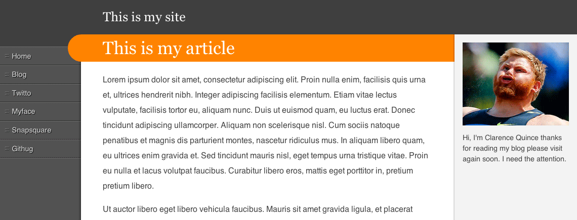
Here's a basic three column design:
Here it is mocked up using flexbox (works in all modern browsers), and here it is using grid layout (works in IE10+). Both look the same, the difference is in how they load:
Browsers can progressively render content as it's streamed from the server, this is great because it means users can start consuming content before it's all arrived. However, when combined with flexbox it causes misalignment and horizontal shifting.
It's difficult to spot too, you're unlikely to notice it while developing locally, or via a super-fast connection. In those cases the page loads too quickly to notice. Here's a demo that displays the columns on a delay, similar to how they will appear on a slower connection.
Flexbox: content dictates layout
Here's a simplified version of the layout:
.container {
  display: flex;
  flex-flow: row;
}

nav {
  flex: 1;
  min-width: 118px;
  max-width: 160px;
}

.main {
  order: 1;
  flex: 1;
  min-width: 510px;
}

aside {
  flex: 1;
  order: 2;
  min-width: 150px;
  max-width: 210px;
}
The container declares itself as a flexbox, and child elements declare how they'd like to interact with one another within the flexbox.
As the page loads, the container starts to receive the first child, the main content. At this point it's the only child and it has flex: 1, so it gets all of the space. When the nav starts to arrive, the main content has to resize to make room for it, which causes that ugly re-layout.
Grid: container dictates layout (to some extent)
Here's a simplified version of the same layout:
.container {
  display: grid;
  grid-template-columns: (nav) minmax(118px, 160px), (main) minmax(612px, 1fr),
    (aside) minmax(182px, 242px);
}

nav {
  grid-area: nav;
}

.main {
  grid-area: main;
}

aside {
  grid-area: aside;
}
Note: The code above is based on the latest spec and isn't implemented in any browser, yet. You should bother your favourite browser vendor about this.
Here the layout is defined in the container, so the nav is rendered into the middle column as soon as it starts to arrive.
But grid can load poorly too...
To load nicely, you need to restrict yourself to configurations that can be predetermined by the grid container.
Here are some examples that break that:
.container {
  display: grid;
  grid-template-columns:
    /* Size defined by content, so will change with content */ (foo) max-content,
    /* Same again */ (bar) min-content,
    /* Computes to minmax(min-content, max-content), so same again */ (hello)
      auto;
}

aside {
  /* This column isn't defined by the container, so one
     is created dynamically. This will cause content to
     shift as 'aside' appears in the container */
  grid-column: 4;
}
But don't write-off flexbox!
Flexbox is great, it just isn't the best thing for overall page layouts.
Flexbox's strength is in its content-driven model. It doesn't need to know the content up-front. You can distribute items based on their content, allow boxes to wrap which is really handy for responsive design, you can even control the distribution of negative space separately to positive space.
This nav bar by Chris Coyier is a great example of something that makes more sense as a flexbox than grid.
Flexbox and grid play well together, and are a huge step forward from the float & table hacks they replace. The sooner we can use them both in production, the better.
Further reading
- Solving rendering performance problems
- Progressive enhancement is faster - the benefits of progressive rendering

 Twitter
 Github
 YouTube
 Podcast