The anatomy of responsive images
I just had my responsive images epiphany and I'm writing it all down before I forget everything. This is what I know…
Fixed size, varying density
If your image is a fixed size in pixels, but you want to cater for screens of different density, here's the solution:
This works in all modern browsers, and falls back to src in older browsers.
A few more rules, not covered in the image above:
- Each item within
srcsetis<url> <density>x, egcat-2x.jpg 2x - The order of items within the
srcsetdoesn't matter - If you don't specify width/height, the browser will display the image at its native width/height divided by the density. Eg if the 2x resource is picked, it'll be rendered at 50% of the resources width/height
- This is only a hint, even on a 3x device the browser may use the 1x image, perhaps due to poor connectivity
Live example

Varying size and density
Images of varying width are commonly used as part of the content on responsive sites. On this blog, content imagery takes up 100% of the article width, but the article isn't always 100% of the window.
In order for the browser to pick the right image, it needs to know:
- URLs for the image at various sizes
- The decoded width of each of those image resources
- The width of the
<img>
That last one is particularly tricky, as images start downloading before CSS is ready, so the width of the <img> cannot be detected from the page layout.
The key to understanding this syntax is knowing which of these values refer to the window width, the decoded image width, and the <img> width.
Via srcset, the browser knows the resources available and their widths. Via sizes it knows the width of the <img> for a given window width. It can now pick the best resource to load.
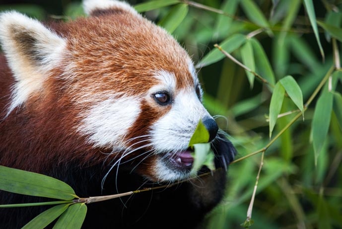
You don't need to specify density, the browser figure that out itself. If the window is 1066px wide or greater, we've signalled that the <img> will be 689px wide. On a 1x device the browser may download panda-689.jpg, but on a 2x device the browser may download panda-1378.jpg.
A few more rules, not covered in the image above:
- Each item within
srcsetis<url> <width-descriptor>w, egpanda-689.jpg 689w - The order of items within the
srcsetdoesn't matter - If
srcsetcontains a width descriptor, thesrcis ignored by browsers that supportsrcset - Each item within
sizesis<media-condition> <image-element-width>, except for the last entry which is just<image-element-width> - Both of the widths in
sizesare in CSS pixels - The browser uses the first media condition match in
sizes, so the order matters - As before, the browser may download a lower resolution image due to other factors such as poor connectivity
Picking which sizes to list is pretty straight forward. Start with your window at its narrowest, and as you increase its size, create a new rule whenever the <img> size vs window size changes formula.
When this window is at its narrowest, the <img> is full width, or 100vw. When the window goes beyond 530px the content area on this page gets 32px padding on the left and 64px on the right, so the <img> is now calc(100vw - 96px).
The browser won't call the police if it finds out you lied about the <img> width. I've been accurate with my sizes, but a rough answer can be good enough, eg sizes="(min-width: 1066px) 689px, (min-width: 800px) 75vw, 100vw".
Picking which resources to create and include in srcset is much harder, and I don't think I've mastered it. In the above example I include the maximum size the <img> can be (689px) and double that for 2x devices (1378px). The other two are rough in-between values. I didn't include smaller widths such as 320px, under the assumption that screens of that size will be 2x density or greater.
srcset + sizes works in Chrome, Firefox, and Opera. For other browsers, it'll safely fall back to src. You don't have to wait long for better support here, it's in WebKit nightly & will appear in the next stable version of Edge.
Live example
Varying width, density, and art direction
Similar to the previous example, but the framing changes at different widths. This allows you to focus in on the subject at smaller widths.
- You can have as many
<source>s as you want - You must include an
<img> - The media query on
<source>will always be obeyed, it's not just a hint - The media query is based on the window's width, not the
<img> - The first matching
<source>will be used, so the order matters - If no matching
<source>is found, the<img>is used - The
<img>must appear after all<source>s <source>doesn't supportsrc, butsrcset="whatever.jpg"works just as well
Once the <source> or <img> is selected, the srcset and sizes attributes work as in previous examples, so you can mix and match techniques.
The <picture> element works in Chrome, Firefox, and Opera, and falls back to the <img> in other browsers. I'm told it might make it into the next release of Edge, which is nice.
Live example

Varying on type
This method allows you to serve better-optimised formats to browsers that support them.
typeis a mime type- You can have multiple sources and mix
typewithmedia,srcset, and evensizesto create something truly monstrous/awesome
This works in Chrome, Firefox, and Opera, and falls back to the <img> in other browsers.
Live example

Further reading
Hopefully the above helps as a kind of quick reference to the various use-cases, but if not, dig into these:
- A 10-part novella on responsive images - by Jason Grigsby
- Responsive Images: Use Cases and Code Snippets - similar to this article, but covers more combinations of use-cases
- Client hints - a server-side alternative to responsive images
Thanks to Mike Hall, Jason Grigsby, Simon Peters, and Yoav Weiss for proofreading and point-sharpening.

 Podcast
 Mastodon
 Bluesky
 Threads
 Muskhole
 Github
 RSS
RSS