Fixing my tooltip accessibility mistake
I made an accessibility error, and I want you to learn from my mistakes.
I've been making short videos recently about web platform features as they land in Firefox, and also about other web standards & development stuff. If you'd prefer to watch a 3-minute video version of this article, pick your platform, and give the account a follow if this kind of thing interests you:
 Instagram
 TikTok
 YouTube
 Mastodon
 LinkedIn
The account is also on Bluesky, but video uploading has been broken there for a while.
Otherwise, here's the written version…
What I did
I made the accessibility error when I created a tooltip like this:
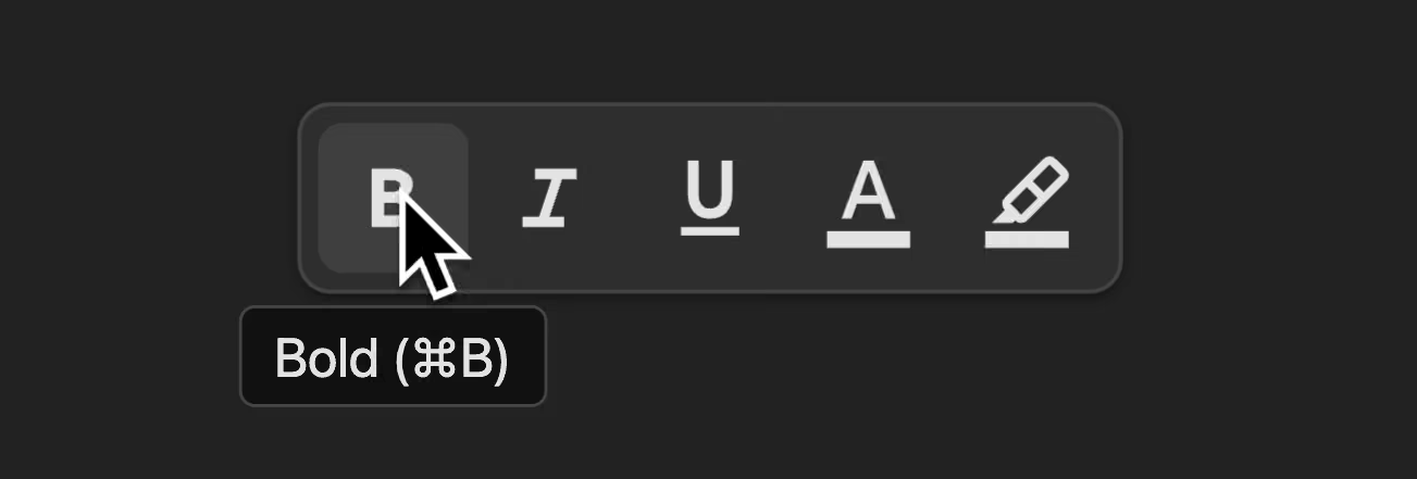
That was part of a video on popover="hint", which also covers how to show the tooltip for visual users. Oh ok, here are links to that video too:
I did try to get it right! I spoke to friends who know more about accessibility than me, and they pointed me towards these demos by Scott O'Hara.
Now, Scott knows what he's talking about, so I figured I could just copy the patterns in his demo. Scott's demos predate hint popovers, so here's a modernised version of one of his examples:
<button aria-describedby="edit-tooltip"> Edit</button><div id="edit-tooltip" popover="hint"> Modify account settings.</div><button aria-describedby="edit-tooltip">Edit</button><div id="edit-tooltip" popover="hint"> Modify account settings.</div><button aria-describedby="edit-tooltip">Edit</button><div id="edit-tooltip" popover="hint">Modify account settings.</div>The button is connected to the tooltip with aria-describedby, so screen readers will usually read the tooltip when the button is focused.
One of the nice things about aria-describedby is that it works even if the element it's pointing at is hidden, which is the case here.
So, I adapted Scott's code for my toolbar demo:
<button aria-label="Bold" aria-describedby="bold-tooltip"> <svg>(bold icon)</svg></button><div id="bold-tooltip" popover="hint"> Bold (⌘B)</div><button aria-label="Bold" aria-describedby="bold-tooltip"> <svg>(bold icon)</svg></button><div id="bold-tooltip" popover="hint">Bold (⌘B)</div><button aria-label="Bold" aria-describedby="bold-tooltip"> <svg>(bold icon)</svg></button><div id="bold-tooltip" popover="hint">Bold (⌘B)</div>It's a very similar pattern, although I have aria-label on the button, because it contains an SVG icon rather than text.
Like Scott, I added aria-describedby to the button, to connect the button to the tooltip.
I tested it in VoiceOver, and it said "Bold. Bold. Command B. Button". And I thought, that's not quite right - it doesn't need to say "bold" twice.
That was happening because, unlike Scott's example, where the tooltip contained just additional content, my tooltip also contains the label. Bold is said twice, because it's there, twice.
So I dropped the aria-label…
<button aria-label="Bold" aria-describedby="bold-tooltip"><button aria-describedby="bold-tooltip"> <svg>(bold icon)</svg></button><div id="bold-tooltip" popover="hint">Bold (⌘B)</div>…and VoiceOver now said "Clickable image. Bold. Command B. Button". I thought, that'll do! I hit publish on my video, and I went to the pub.
Where I went wrong
I got a message from Léonie Watson and Gez Lemon from the accessibility agency TetraLogical, telling me, very politely, that I'd done a silly.
Scott's pattern was correct, but I'd gone off the rails when I removed the aria-label, because now, the button has no accessible name. aria-describedby provides additional information - it isn't a replacement for the accessible name.
In fact, JAWS on Windows tries to gather accessible text from nearby elements, and ends up announcing the bold button as both bold and italic, since the italic tooltip element was a sibling in the DOM.
There was a bit of a clue when VoiceOver said "clickable image" - this was VoiceOver indicating it didn't have an accessible name to announce. I just didn't realise it at the time.
The fix
Léonie and Gez told me how to fix it: I switched from aria-describedby to aria-labelledby.
<button aria-describedby="bold-tooltip"><button aria-labelledby="bold-tooltip"> <svg>(bold icon)</svg></button><div id="bold-tooltip" popover="hint">Bold (⌘B)</div>aria-labelledby works like aria-describedby, but it provides the accessible name, rather than additional description.
Now the button gets its accessible name from the tooltip, and VoiceOver says "Bold. Command B. Button." - perfect!
If I wanted, I could split this up, so the accessible name is just "Bold", and the additional description is "Command B":
<button aria-labelledby="bold-label" aria-describedby="bold-description"> <svg>(bold icon)</svg></button><div id="bold-tooltip" popover="hint"> <span id="bold-label">Bold</span> <span id="bold-description" >(⌘B)</span ></div><button aria-labelledby="bold-label" aria-describedby="bold-description"> <svg>(bold icon)</svg></button><div id="bold-tooltip" popover="hint"> <span id="bold-label">Bold</span> <span id="bold-description">(⌘B)</span></div>I think that's overkill in this case, but it might make sense if you have a tooltip with a longer description.
So there you go! Always ensure interactive elements have an accessible name. And test with multiple screen readers if you can. Testing in one screen reader is like testing in one browser - it doesn't always give you the full picture.
Here's the fixed demo, although it doesn't work quite right in Safari, as it doesn't yet support popover="hint".

 Podcast
 Mastodon
 Bluesky
 Threads
 Muskhole
 Github
 RSS
RSS